Pos Terbaru Kreatifa Media

How to Improving Your Site’s User Experience

Friday, April 12, 2013


Red Digital Agency
Red presents a good balance of white space, imagery, text and color to reveal its purpose and capture attention.

When it comes to web design, the quality of experience that users have with a site determines whether it’s successful or not – regardless of how visually catchy the design is. A positive experience drives sales and conversions, while a negative one deters visitors from staying or returning. Therefore performance optimization should be a central part of your design process if you’re aiming for high conversions and user satisfaction. Here are some ways to improve your site’s user experience.

Increase Site Speed

Consider how many people take out their phones to quickly check email or look something up when they have a spare second in the day. Whether it’s while waiting for the bus, standing in line for coffee or running to a meeting, they expect to achieve their goal on the web in that short amount of time. Forty percent of users will abandon a page after waiting longer than 3 seconds, and many people share their bad site experiences with others. It’s your job as a designer to make sure your site is loading fast enough to satisfy these standards and to make sure yours provides an experience that gets positive feedback.
To begin the process of improving your speed, first use a site speed testing tool to measure how it’s currently performing. Then make changes like:
  • Resize or remove large images and files
  • Reduce the number of plug-ins in your site
  • Eliminate flash files, which greatly weigh down performance
  • Cache your site so that it won’t have to take time to fully assemble every time a user accesses it
  • Always retest your speed after making changes so you know what is effective in improving it.

Clean Up Your Navigation

Reassess your navigation system: does your menu and search field honor conventions in that they are easily identifiable and usable? Minimize the number of options users have when entering your site by combining pages/content and getting rid of low-traffic pages. The fewer options there are, the more direct your site’s purpose is, and the easier it is for users to decide where they want to go. You can evaluate how users currently use your site by carrying out usability tests and referring to your site analytics data.

Aim For High Conversion Rates

You can be sure that a high converting website is also highly usable. Focus on the usability of your site, and user satisfaction (and in turn, conversions) will follow. To maximize usability:
  • Make your purpose clear. Use recognizable and concise calls-to-action so that users know exactly what they are meant to do with your site. Show users the value your product or service will add to their lives.
  • Be consistent. Make sure each page of your site sends the same message, and shares the style of design elements and layout.
  • Make text readable. Tailor your content to be easily perceived while users scan the page. Headlines, variations in font sizes and weights, and breaks in text blocks create a breathable set of information that can be retained even while glancing through it.
  • Keep it simple. Comparable to the fact that simple navigation makes it easier for users to decide what to do, simplicity in your entire site design keeps users from being overwhelmed with information. Ample white space and a unified style give users a sense of comfort and professionalism, and builds their confidence that they’ll find what they’re looking for quickly.

Build Trust

Visitors to your site will have a more positive experience if they can trust you. Whether it’s the validity of your information, your protection of their personal information or confidence in the quality of your product, it’s important to give them reason to trust you. You can do this by providing visible contact information, allowing customer feedback, presenting previous customer testimonials and/or client logos, and displaying your SSL certificate if you have a registration or checkout page.
When working to improve your site’s user experience, just remember to consider what your audience is looking for, and test and measure the changes you make to create a more effective and usable site.

source: http://tutorialzine.com/2013/04/improving-your-sites-user-experience/

Portraits: Inspirational Website

Sunday, April 7, 2013

VIEW GALLERY        -        GET INSPIRED


Portraits has a beautiful, clean and flat design brought to the next level. Subtle effects and a great color scheme make it our pick this week.

1. choose your best photo to use as the base for your works of art!
2. Give your piece of work a little personality with color, texture and a caption.
3. Share your unique portrait with friends and family online, or get a high-quality print made!

VIEW GALLERY        -        GET INSPIRED

Tutorial: 3D-ifying Documents Using CSS Transforms


Cameron Lakenen from Crocodoc explains how they use SVG to do some fancy 3D effects when converting documents.

Note: the demos in this blog post require IE 9+ (preferably 10), Firefox, or any WebKit browser. If you’re on a mobile device, you might need to click the open in new page button to view the demos properly.


Prime free techy font

Saturday, December 1, 2012


Prime is a simple typeface with a techy feel and a strict, geometric origin. I wanted to create something that offers great readability in various sizes yet still offers enough subtle differences to stand out. Basic and somewhat neutral, it can be used in a variety of ways from distinct titles to body text.  – Max Pirsky

Designed by Max Pirsky | Portfolio link
Source: http://fontfabric.com/prime-free-font/

How To Backup WordPress

Saturday, March 3, 2012

It’s been 6 years I am using WordPress and there is a major method every WordPress user must know and that is how to safely backup WordPress. In this tutorial you will lean how to backup WordPress database, posts, comments, database, plugins & themes. Not only this, in this method I’ll tell you how to backup all WordPress files through cPanel in one click. After taking backup you can make a copy of your blog offline and can also move your blog to another host. By following the method below you will not loose any single setting and any single file and the steps below are 100% secure.


Requirements

In order to successfully complete the backup process you need to have :
  1. FTP details
  2. cPanel details
  3. Knowledge of how to install Plugins


Step 1 : Take backup of WordPress themes and settings

First of all install a WordPress plugin called WP DB Backup to take complete backup of your database and after installing it go to Backup under Tools :

Select your backup options. You will see three backup options, you may choose anyone you like but I prefer the 3rd one.
  • Save to server
  • Download backup to PC
  • Email backup
Click on Backup now! button
After you click on Back now! button, automatic backup will start and a dialog box will appear asking you to save the backup file. The backup file extension will be of sql.gz
You can also schedule backup hourly, daily and weekly. After selecting desired options click on Schdeule Backup
This sql.gz file includes backups of :
  • Theme
  • Permalinks
  • Plugins settings
  • All posts, comments and settings
Congratulations, you’ve successfully backed up important files of your blog. Now, its time to take backup of WordPress files in your blog.


Step 2 : Taking backup of WordPress files

To restore your blog, you first need to log into your website cpanel by typing www.your-blog-name.com/cpanel. After you log into cPanel, under Files click on File Manager

Now, in the File Manager open to the folder where your blog is located

After opening your blog folder, at the top click on Select All and it will select all the files of your blog. After clicking on Select all click on Compress button just above it.

Compress button will make a ZIP file of complete files on your server and will also reduce the size of the files, this will help you to download the backup. Now, select your file compression format and at the bottom click on Compress Files


When you will click on Compress files, it will start compressing the files and will generate a dot zip file in your blog directory. In my case it is .qidb.zip. It can be different in your case.
Now, select that file and download it in your PC.

Congratulations, now you have taken complete backup of your WordPress blog including all WordPress files, theme settings, plugins, posts, comments and all other things. This is the most secure and easy way to take backup of your blog. I always use this method and till now I have not faced any problem.

sorce: http://www.creativebloggingideas.com/how-to-backup-wordpress-100-secure-working-method.html

Fancy Beautiful JQuery Image Slider with zSlider

Sunday, February 26, 2012

Demo          -         Download          -          Source


zSlider is a beautiful image slider for your web applications. The developer create this for those people who needs a fancy jquery image slider with a simple to use but for limited number of images.
This slider accepts two lists of images, each list will have 12 thumbs limit which means you can add 24 images in this gallery.

Currently this version has some limitations such as number of images to be used and maximum limit of images.
This slider has feature such as:

- Play Paus Button
- Navigate through First and Second List
- Control images with Arrow keys on Keyboard
- Click to see a specif image
- Caption on Images

 Limitations :
There are few limitations in this gallery such as you have to use 6,9 or 12 images for one slider. It means if you have 5 images then you cant use this slider. If you have 9 then add all thumbs in first list and assign var totalThumbsFirstList = 9;
and set var totalThumbsSecondList = 0; If you have 18 Images then assign 12 to first and remaining 6 to second list and then you will define param like this:
var totalThumbsFirstList = 12;
var totalThumbsSecondList = 6;
In short this is perfect for 12 or 24 images so try to use 12 or 24 images. We have another variable for controlling the sliding interval which is :
var Interval = 6000;//6 seconds

Tutorial How to create animated tooltips with CSS3

Wednesday, February 1, 2012

Demo     -      Download     -       Source


In today’s tip we’ll show you how to create some simple, animated tooltips using CSS transitions and the pseudo-classes :before and :after.

The idea is to have a list with links or in our case, social icons, that reveal a little tooltip on hover.
The unordered list will look like this:

1
2
3
4
5
6
7
8
<ul class="tt-wrapper">
    <li><a class="tt-gplus" href="#"><span>Google Plus</span></a></li>
    <li><a class="tt-twitter" href="#"><span>Twitter</span></a></li>
    <li><a class="tt-dribbble" href="#"><span>Dribbble</span></a></li>
    <li><a class="tt-facebook" href="#"><span>Facebook</span></a></li>
    <li><a class="tt-linkedin" href="#"><span>LinkedIn</span></a></li>
    <li><a class="tt-forrst" href="#"><span>Forrst</span></a></li>
</ul>
The list elements will be floating left and the anchors will have the following style:
1
2
3
4
5
6
7
8
9
.tt-wrapper li a{
    display: block;
    width: 68px;
    height: 70px;
    margin: 0 2px;
    outline: none;
    background: transparent url(../images/icons.png) no-repeat top left;
    position: relative;
}

Each anchor will have a different background position for the background image:
1
2
3
4
5
6
7
8
9
10
11
12
13
14
15
16
17
18
.tt-wrapper li .tt-gplus{
    background-position: 0px 0px;
}
.tt-wrapper li .tt-twitter{
    background-position: -68px 0px;
}
.tt-wrapper li .tt-dribbble{
    background-position: -136px 0px;
}
.tt-wrapper li .tt-facebook{
    background-position: -204px 0px;
}
.tt-wrapper li .tt-linkedin{
    background-position: -272px 0px;
}
.tt-wrapper li .tt-forrst{
    background-position: -340px 0px;
}

The span will work as our tooltip and we will “hide” it by setting its initial opacity to 0. The effect I want to share with you is the tooltip fading in and appearing from the top, so we will give it a bottom of 100px, placing it above the anchor:
1
2
3
4
5
6
7
8
9
10
11
12
13
14
15
16
17
18
19
20
21
22
23
24
.tt-wrapper li a span{
    width: 100px;
    height: auto;
    line-height: 20px;
    padding: 10px;
    left: 50%;
    margin-left: -64px;
    font-family: 'Alegreya SC', Georgia, serif;
    font-weight: 400;
    font-style: italic;
    font-size: 14px;
    color: #719DAB;
    text-shadow: 1px 1px 1px rgba(0, 0, 0, 0.1);
    text-align: center;
    border: 4px solid #fff;
    background: rgba(255,255,255,0.3);
    text-indent: 0px;
    border-radius: 5px;
    position: absolute;
    bottom: 100px;
    opacity: 0;
    box-shadow: 1px 1px 2px rgba(0,0,0,0.1);
    transition: all 0.3s ease-in-out;
}

Since we will make the tooltip appear on hover over the anchor (and the span counts as part of the anchor) the tooltip will also appear when hovering over the area above the anchor (the span is still there, it’s just the 0 opacity that makes it invisible).

For the little pointer, we will style the pseudo-elements :before and :after. We will style them the same way and create a triangle by using transparent left and right borders. The :before pseudo-element will serve as a shadow for the :after pseudo-element, so we’ll give it a black rgba value with a low opacity:

1
2
3
4
5
6
7
8
9
10
11
12
13
.tt-wrapper li a span:before,
.tt-wrapper li a span:after{
    content: '';
    position: absolute;
    bottom: -15px;
    left: 50%;
    margin-left: -9px;
    width: 0;
    height: 0;
    border-left: 10px solid transparent;
    border-right: 10px solid transparent;
    border-top: 10px solid rgba(0,0,0,0.1);
}
The :after pseudo-element will be placed a pixel away and we’ll make it white, just like the border of the tooltip itself:
1
2
3
4
5
.tt-wrapper li a span:after{
    bottom: -14px;
    margin-left: -10px;
    border-top: 10px solid #fff;
}

So, on hover, we will make the span move from the top and fade in:
1
2
3
4
.tt-wrapper li a:hover span{
    opacity: 0.9;
    bottom: 70px;
}

And voilà! Very simple animated tooltips! In the second demo, you can see an alternative style for the tooltip (a funny circle) which scales up from the anchor and in the third demo the tooltips are rotated. The forth demo shows another neat effect.

The beautiful social icons in the demo are by Emir Ayouni (growcase.com).
I hope you enjoyed this little effect and find it useful!

Tutorial - Question of the Day with CodeIgniter and MySQL

Thursday, January 19, 2012

Demo   -    Download    -     Source


In this tutorial we will build a small application with CodeIgniter that will be backed by a MySQL database. It will present questions and give visitors the ability to post answers. There isn’t an admin interface for adding or changing questions, but if you follow and understand this tutorial, you will be able to create one yourself.

As this might be the first exposure to CodeIgniter for some of you, we will start with a brief intro. If you know what CI is, you can skip directly to the code.

Original Website Templates 001


Original Website Templates 001
4 EPS | 4 AI | JPG Preview | 52 MB

Tutorial Make Neat Lightbox Effect Using CSS3

Tuesday, January 17, 2012


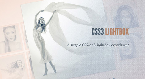
This Tutorial will show you how to create a neat lightbox effect using only CSS3. The idea is to have some thumbnails that are clickable, and once clicked, the respective large image is shown. Using CSS transitions and animations, we can make the large image appear in a fancy way.

Tutorial Fullscreen Background Image Slideshow with CSS3

Monday, January 16, 2012

 Tutorial Fullscreen Background Image Slideshow with CSS3

On this tutorial we will create a CSS3 fullscreen background image slideshow. We’ll create different image transitions and also make a title appear using CSS animations.

The images are by Mark Sebastian and they are licensed under the Creative Commons Attribution-ShareAlike 2.0 Generic License.

Note that this will only work in browsers supporting CSS animations.
This tutorial is a part of our latest CSS3 experiments; you can find more of those here:

Make CSS Buttons with Pseudo-elements


On this tutorial we will experimenting with the power of CSS pseudo elements, specially when it comes to mixing them with buttons and that way recreating some great effects that were only possible to do with sprites, in the past.


In this tutorial, we will  show you how to create buttons with a twist, using just one anchor tag per button and the great power of CSS.

Feminina Magazine - Magazine Blogger Template

Saturday, January 14, 2012


 Feminina Magazine - Magazine Blogger Template -

Template Women is a magazine style theme created by Templates Novo Blogger. Its a 3 column template with a slider, summarised display of latest posts by categories on the home page and a 3 column footer.

 To modify the slider, click on Design-Edit Html and look for the below code -


<!--INICIO DO SLIDE-->

<div id='s3slider'>
<ul id='s3sliderContent'>
<li class='s3sliderImage'>
<a href='COLOQUE AQUI O LINK DO POST'><img src='COLOQUE AQUI O LINK DA IMAGEM'/></a>
<span>COLOQUE AQUI A LEGENDA<br/>
</span>
</li>

Add your post url here - 'COLOQUE AQUI O LINK DO POST'
image url here - 'COLOQUE AQUI O LINK DA IMAGEM' and post description in this line - 'COLOQUE AQUI A LEGENDA'. Similarly, follow the same steps for rest of the slides and save the changes. The image size should be 610px (width) and 310px (height).

In this template, the main column displays in a different style, latest posts from selected labels appear in a summarized format. To get this working, go to Design--Edit Html and search for this code -

imgr = new Array();
imgr[0] = "http://sites.google.com/site/fdblogsite/Home/nothumbnail.gif";
showRandomImg = true;
aBold = true;
summaryPost = 60; // numero de caracteres do resumo
summaryTitle = 25; //numero de caracteres do titulo
numposts = 3; // numero de resumos por categoria

var contarlabels = 0;
labelname = new Array("Desfiles","Gastronomia","Moda","Beleza");
labeltitle = new Array("Desfiles","Gastronomia","Moda","Beleza");


Add the image url in the link marked in italics, that will appear when there are no pictures in the post. While add the labels (marked in bold) of your choice which you want to show up on the home page.

Also search for this code in Edit Html and add your blog url (marked in bold).
salida + = '<div class="featured">';
salida + = '<h3>' + labeltitle [contarlabels] + '</ h3>';
salida salidainner + =;
salida + = '<b> <a href=" http://templatefeminina.blogspot.com /search/label/' labelname[contarlabels] + + More'?max-results=10">' + LabelName [contarlabels] + '</ a> </ b>';
salida + = '</ div>';
document.write (salida);
contarlabels + +;
}


Replace all the links which are marked in bold with your blog url and add the labels you've selected as well. It will appear in the same order on the home page as the code.

<script src='http://templatefeminina.blogspot.com/feeds/posts/default/-/Desfiles?max-results=3&amp;orderby=published&amp;alt=json-in-script&amp;callback=showrecentposts'/>

<script src='http://templatefeminina.blogspot.com/feeds/posts/default/-/Gastronomia?max-results=3&amp;orderby=published&amp;alt=json-in-script&amp;callback=showrecentposts'/>

<script src='http://templatefeminina.blogspot.com/feeds/posts/default/-/Moda?max-results=3&amp;orderby=published&amp;alt=json-in-script&amp;callback=showrecentposts'/>

<script src='http://templatefeminina.blogspot.com/feeds/posts/default/-/Beleza?max-results=3&amp;orderby=published&amp;alt=json-in-script&amp;callback=showrecentposts'/>


You can change the number of posts per label as well, in the above code change - max-results=3. While the sidebar includes the normal features like archives, tag cloud, search box etc. This theme also has a 3 column footer space to add more blogger widgets.


Free Filter Functionality Tutorial with CSS3

Thursday, January 12, 2012


The Markup

Let’s start with the markup. Our aim is to have four filter buttons that, once clicked, will make the respective type appear or stand out. So, we’ll use some radio buttons that all have the same name since they should belong to the same group (hence only one can have the “checked” state). By default, we want the “all” radio button to be selected or checked. We’ll add some labels for the radio buttons that we will use in order to hide the radio buttons. Clicking a label will select the radio buttons with the respective ID:
01<section class="ff-container">
02 
03    <input id="select-type-all" name="radio-set-1" type="radio" class="ff-selector-type-all" checked="checked" />
04    <label for="select-type-all" class="ff-label-type-all">All</label>
05 
06    <input id="select-type-1" name="radio-set-1" type="radio" class="ff-selector-type-1" />
07    <label for="select-type-1" class="ff-label-type-1">Web Design</label>
08 
09    <input id="select-type-2" name="radio-set-1" type="radio" class="ff-selector-type-2" />
10    <label for="select-type-2" class="ff-label-type-2">Illustration</label>
11 
12    <input id="select-type-3" name="radio-set-1" type="radio" class="ff-selector-type-3" />
13    <label for="select-type-3" class="ff-label-type-3">Icon Design</label>
14 
15    <div class="clr"></div>
16 
17    <ul class="ff-items">
18        <li class="ff-item-type-1">
19            <a href="http://dribbble.com/shots/366400-Chameleon">
20                <span>Chameleon</span>
21                <img src="images/1.jpg" />
22            </a>
23        </li>
24        <li class="ff-item-type-2">
25            <!-- ... -->
26        </li>
27        <li class="ff-item-type-3">
28            <!-- ... -->
29        </li>
30        <!-- ... -->
31    </ul>
32 
33</section>
The unordered list will contain all the portfolio items as anchors with an image and a span. Each list element will have a type class that will make it possible to identify those elements and “filter” them when we click on one of the radio buttons.


The CSS

We’ll be going through three example effects, but first, let’s take a look at the common style.
I will omit all the vendor prefixes, but you will, of course, find them in the files.
The main section container will have a specific width:
1.ff-container{
2    width: 564px;
3    margin: 10px auto 30px auto;
4}
The labels will cover the radio buttons and we’ll give them a fancy gradient and some subtle box shadows:
01.ff-container label{
02    font-family: 'BebasNeueRegular', 'Arial Narrow', Arial, sans-serif;
03    width: 25%;
04    height: 30px;
05    cursor: pointer;
06    color: #777;
07    text-shadow: 1px 1px 1px rgba(255,255,255,0.8);
08    line-height: 33px;
09    font-size: 19px;
10    background: linear-gradient(top, #ffffff 1%,#eaeaea 100%);
11    float:left;
12    box-shadow:
13        0px 0px 0px 1px #aaa,
14        1px 0px 0px 0px rgba(255,255,255,0.9) inset,
15        0px 1px 2px rgba(0,0,0,0.2);
16}
At the corners we want some rounded edges, so the first label and the last one will get this specific border radius:
1.ff-container label.ff-label-type-all{
2    border-radius: 3px 0px 0px 3px;
3}
4.ff-container label.ff-label-type-3{
5    border-radius: 0px 3px 3px 0px;
6}
For every checked radio button, we want the respective label to have this “pressed” style:
01.ff-container input.ff-selector-type-all:checked ~ label.ff-label-type-all,
02.ff-container input.ff-selector-type-1:checked ~ label.ff-label-type-1,
03.ff-container input.ff-selector-type-2:checked ~ label.ff-label-type-2,
04.ff-container input.ff-selector-type-3:checked ~ label.ff-label-type-3{
05    background: linear-gradient(top, #646d93 0%,#7c87ad 100%);
06    color: #424d71;
07    text-shadow: 0px 1px 1px rgba(255,255,255,0.3);
08    box-shadow:
09        0px 0px 0px 1px #40496e,
10        0 1px 2px rgba(0,0,0,0.1) inset;
11}
Since we have all our elements in one level, we use the general sibling combinator which is represented by a “tilde” (~) character, in order to reach the respective label. With this “trick” we will also get to all those different types in the portfolio list.
The inputs can be hidden, since we have our labels that will do the job:
1.ff-container input{
2    display: none;
3}
Let’s move on to the item list:
1.ff-items{
2    position: relative;
3    margin: 0px auto;
4    padding-top: 20px;
5}
The anchor and the span element will have the following style:
01.ff-items a{
02    display: block;
03    position: relative;
04    padding: 10px;
05    background: #fff;
06    box-shadow: 0 1px 2px rgba(0, 0, 0, 0.1);
07    margin: 4px;
08    width: 160px;
09    height: 120px;
10}
11.ff-items a span{
12    display: block;
13    background: rgba(113,123,161, 0.9);
14    font-style: italic;
15    color: #fff;
16    font-weight: bold;
17    padding: 20px;
18    position: absolute;
19    bottom: 10px;
20    left: 10px;
21    width: 120px;
22    height: 0px;
23    overflow: hidden;
24    opacity: 0;
25    text-align: center;
26    text-shadow: 1px 1px 1px #303857;
27    transition: all 0.3s ease-in-out;
28}
29.ff-items a:hover span{
30    height: 80px;
31    opacity: 1;
32}
33.ff-items li img{
34    display: block;
35}   

When we hover over an anchor, we’ll make the span appear from the bottom, animating its opacity with a transition.

Allright, that was all the “common” style. Now, let’s see how we can filter those elements in style!
 
Support : Femin Collection | Habitat Design | Kreatifa Media
Copyright © 2013. Kreatifa Media - All Rights Reserved
Template Created by Habitat Design Published by Kreatifa Media
Proudly powered by Blogger